2026
Magneta Ice Cream -Landing Page
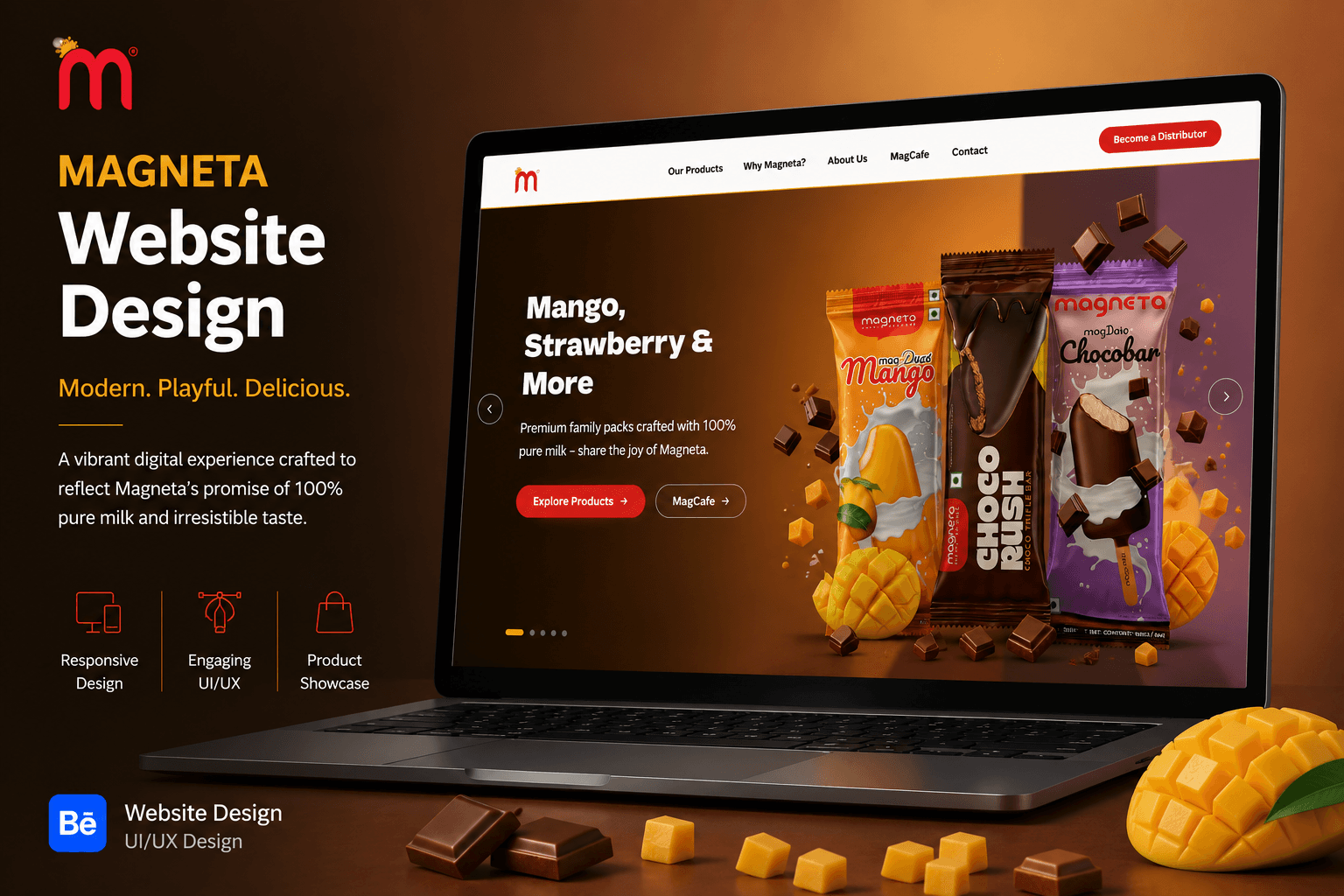
Magneta Ice Creams is a vibrant and engaging digital experience designed to showcase the brand’s delicious range of ice creams through bold visuals, playful design, and an easy-to-explore product journey. The landing page combines colorful imagery, expressive typography, and clear content sections to create a memorable experience that reflects the fun and refreshing character of the brand.
Portfolio
Food & Beverage
Overview
Magneta Ice Cream is a vibrant landing page designed to showcase the brand's range of ice creams through a playful, colorful, and product-focused digital experience.
A Vibrant Digital Experience for Magenta Landing Page
The website brings together Magenta's products, flavours, premium ranges, MagCafe experience, brand story, and customer touchpoints within one cohesive experience. The design combines bold product imagery, expressive typography, warm colours, and clear calls to action to reflect the playful character of the brand while keeping the interface easy to explore.

Design Objective
The objective was to create a fresh and visually engaging experience that communicates Magneta's playful personality while keeping the products and flavors at the center of the experience.
The design uses a vibrant pink and magenta-inspired visual identity, bold typography, and colorful product imagery to create an energetic and memorable interface. Clear sections and strong visual hierarchy help users naturally move from discovering the brand to exploring its products.

Product Discovery
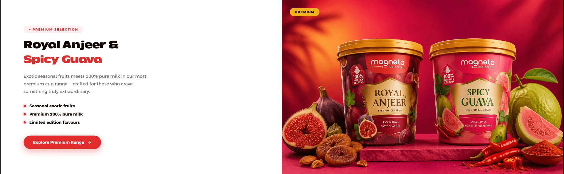
The product section gives users a clear overview of Magenta's diverse ice cream categories.
Products are organised into visually consistent cards covering cones, choco bars, kulfies, popsicles, cups, and novelties. Each card combines imagery, category naming, and a short description, allowing users to quickly scan the range before exploring further.
Brand Values
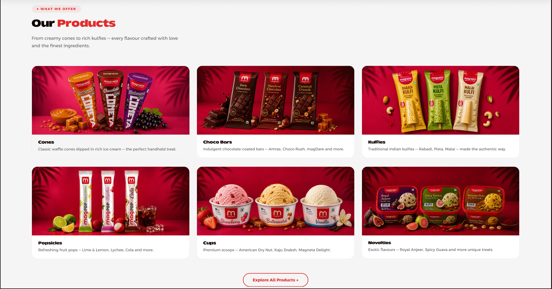
This section communicates the qualities that differentiate Magenta and reinforce its product positioning.
A combination of lifestyle imagery and concise value statements communicates the brand's focus on pure milk, natural ingredients, and quality. Supporting statistics such as flavour variety add credibility while keeping the section visually engaging.
More Works
(GQ® — 02)
©2024


FAQ
01
What is your design process?
02
What services do you offer?
03
What tools do you use?
04
How long does a project typically take?
05
What do you need from me to get started?
2026
Magneta Ice Cream -Landing Page
Magneta Ice Creams is a vibrant and engaging digital experience designed to showcase the brand’s delicious range of ice creams through bold visuals, playful design, and an easy-to-explore product journey. The landing page combines colorful imagery, expressive typography, and clear content sections to create a memorable experience that reflects the fun and refreshing character of the brand.
Portfolio
Food & Beverage
Overview
Magneta Ice Cream is a vibrant landing page designed to showcase the brand's range of ice creams through a playful, colorful, and product-focused digital experience.
A Vibrant Digital Experience for Magenta Landing Page
The website brings together Magenta's products, flavours, premium ranges, MagCafe experience, brand story, and customer touchpoints within one cohesive experience. The design combines bold product imagery, expressive typography, warm colours, and clear calls to action to reflect the playful character of the brand while keeping the interface easy to explore.
Design Objective
The objective was to create a fresh and visually engaging experience that communicates Magneta's playful personality while keeping the products and flavors at the center of the experience.
The design uses a vibrant pink and magenta-inspired visual identity, bold typography, and colorful product imagery to create an energetic and memorable interface. Clear sections and strong visual hierarchy help users naturally move from discovering the brand to exploring its products.
Product Discovery
The product section gives users a clear overview of Magenta's diverse ice cream categories.
Products are organised into visually consistent cards covering cones, choco bars, kulfies, popsicles, cups, and novelties. Each card combines imagery, category naming, and a short description, allowing users to quickly scan the range before exploring further.
Brand Values
This section communicates the qualities that differentiate Magenta and reinforce its product positioning.
A combination of lifestyle imagery and concise value statements communicates the brand's focus on pure milk, natural ingredients, and quality. Supporting statistics such as flavour variety add credibility while keeping the section visually engaging.
More Works
(GQ® — 02)
©2024
FAQ
01
What is your design process?
02
What services do you offer?
03
What tools do you use?
04
How long does a project typically take?
05
What do you need from me to get started?
2026
Magneta Ice Cream -Landing Page
Magneta Ice Creams is a vibrant and engaging digital experience designed to showcase the brand’s delicious range of ice creams through bold visuals, playful design, and an easy-to-explore product journey. The landing page combines colorful imagery, expressive typography, and clear content sections to create a memorable experience that reflects the fun and refreshing character of the brand.
Portfolio
Food & Beverage
Overview
Magneta Ice Cream is a vibrant landing page designed to showcase the brand's range of ice creams through a playful, colorful, and product-focused digital experience.
A Vibrant Digital Experience for Magenta Landing Page
The website brings together Magenta's products, flavours, premium ranges, MagCafe experience, brand story, and customer touchpoints within one cohesive experience. The design combines bold product imagery, expressive typography, warm colours, and clear calls to action to reflect the playful character of the brand while keeping the interface easy to explore.
Design Objective
The objective was to create a fresh and visually engaging experience that communicates Magneta's playful personality while keeping the products and flavors at the center of the experience.
The design uses a vibrant pink and magenta-inspired visual identity, bold typography, and colorful product imagery to create an energetic and memorable interface. Clear sections and strong visual hierarchy help users naturally move from discovering the brand to exploring its products.
Product Discovery
The product section gives users a clear overview of Magenta's diverse ice cream categories.
Products are organised into visually consistent cards covering cones, choco bars, kulfies, popsicles, cups, and novelties. Each card combines imagery, category naming, and a short description, allowing users to quickly scan the range before exploring further.
Brand Values
This section communicates the qualities that differentiate Magenta and reinforce its product positioning.
A combination of lifestyle imagery and concise value statements communicates the brand's focus on pure milk, natural ingredients, and quality. Supporting statistics such as flavour variety add credibility while keeping the section visually engaging.
More Works
©2024
FAQ
What is your design process?
What services do you offer?
What tools do you use?
How long does a project typically take?
What do you need from me to get started?